Guidelines for Effective Letterspacing in Web Typography
Enhancing Readability and Aesthetics through Careful Letterspacing

When it comes to web typography, adjusting letterspacing is often overlooked by many designers. However, even small changes in letter spacing can significantly impact the readability and overall quality of the text. To make informed decisions in web typography, it’s crucial to understand guidelines for effectively letterspacing type.
In this article, I’ll explore some key considerations and provide practical guidelines for letterspacing type on the web, helping you elevate your typography from good to great.
- Capital Letters: Increase letter spacing for the uppercase type since the default spacing is designed to be minimal. Adding a bit more breathing room between characters enhances legibility and aesthetics. For headings, consider a letter-spacing value of around 0.2–0.25 ems, and for acronyms, a value of around 0.05–0.1 ems. This advice applies to uppercase letters and small caps alike.
- Font Size: The relationship between font size and letter spacing is inversely proportional. As font size increases, letterspacing should increase. Adjust the letter spacing as follows: large text (e.g., titles and headings) should have decreased letter spacing. Body text should maintain default tracking or stick close to default letterspacing. Very small text benefits from increased letter spacing for better legibility. Very small text benefits from increased letter spacing for better legibility.
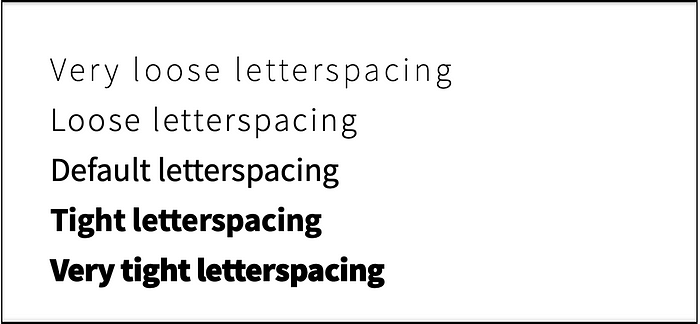
- Font Weight: Similar to font size, font weight affects letter spacing decisions. As weight increases, letterspacing should decrease, and as weight decreases, letterspacing should increase. Light typefaces with an airy aesthetic pair well with open letter spacing, while bold typefaces benefit from closer letter spacing, complementing their dark and heavy aesthetic.
- Light-on-Dark Text: When setting light type on a dark background, a small increase in letterspacing can compensate for the perceived thickness of the text. Adjusting the letterspacing slightly can balance the visual weight, ensuring the text appears bold and readable.
John D. Jameson has written an excellent article entitled Guidelines for Letterspacing Type.
Remember, web typography is an ongoing learning process. By implementing these guidelines and continuously exploring the possibilities, you can create typography that is both visually appealing and highly legible.
Now let’s take your typography to the next level!
